

Block Examples
This is a standard paragraph. Lorem ipsum dolor sit amet, consectetur adipiscing elit. Quisque in posuere dui. Mauris a magna ac ipsum vulputate eleifend sed sit amet magna. Vestibulum vestibulum porta orci ornare pharetra. Sed consectetur eget neque sed hendrerit. Cras quis interdum lectus. Ut et tempor lacus. Proin hendrerit ipsum a posuere dictum. Morbi molestie vulputate lectus, eu fermentum lectus pulvinar laoreet. Integer sed dui egestas, auctor neque venenatis, tincidunt eros. Proin at maximus libero, in venenatis metus. Interdum et malesuada fames ac ante ipsum primis in faucibus.
NNG Brown
OG Green
VGN Green
Spudman Blue
ProPro Green
GPN Purple
FGN Red
Light Grey
This is H1
This is H2
This is H3
This is H4
This is H5
This is H6
- This is
- a List
- with bullets
- This is
- a List
- with numbers
This is the quote block.
This is a pullquote block
Citation for it
This is a Details block (like an accordion) It opens and closes
This is the hidden copy.
| This is the headers | |||
|---|---|---|---|
| This is a table | Four columns, 5 rows | ||
| This is a table. You can change the colors, add headers and footers, make the width fixed or not. | |||
| This is a table | |||
| This is a table | |||
| This is the last row. | |||
| This is the footers. |
This is the Verse block. For poetry, lyrics, etc.
This is a stretchy paragraph. It fits the space.
Stretchy Heading (this is H3)
Below are images with options – they can be left/right/center aligned, have captions, no captions, fill the width of the screen, not fill, you can add filters (to alter color), you can round it completely (you can change the aspect ratio to square, then click rounded and it’s a perfect circle. Or not change the aspect ratio and it’s oblong.
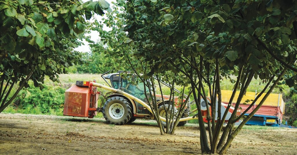
This is a gallery. Also a lot of options. You can round photos, you can add captions, you can link each image to something (or nothing), you can choose how many columns.


This is a cover. You can have the background be an image and then put any other block on top.
The background can be fixed or repeated. The overlay can be solid or gradient, any color. You can also just use a gradient color, see below.
Gradient-only background
You can make this tall, short, add spacers, etc.
And you can choose where the copy is in the space.
I chose bottom right for this one.
Media and Text H2
This is a Media & Text block. The media can be on either left or right, and then you can have any block inside the content area.
The button type is below. You can have set the border radius to round the edges, you can change the font color and the background color. You can have an outline vs. solid color background. You can change the size, etc.
This adds a drop cap. Lorem ipsum dolor sit amet, consectetur adipiscing elit. Quisque in posuere dui. Mauris a magna ac ipsum vulputate eleifend sed sit amet magna. Vestibulum vestibulum porta orci ornare pharetra. Sed consectetur eget neque sed hendrerit. Cras quis interdum lectus. Ut et tempor lacus. Proin hendrerit ipsum a posuere dictum. Morbi molestie vulputate lectus, eu fermentum lectus pulvinar laoreet. Integer sed dui egestas, auctor neque venenatis, tincidunt eros. Proin at maximus libero, in venenatis metus. Interdum et malesuada fames ac ante ipsum primis in faucibus.

This is a Profile Box.
Title for the box.

Name of Testimonial Person
TitleBig Notice!
This is a notice box – maybe to showcase an event coming, etc.
You also have a TWO Spacer blocks. One is just to add empty space. Default is 100 px height, but you can alter it at will.
This is a Spacer with a divider in it. You can change the height of the space, the line and the color of the line.
This is the Call to Action Block.
You can have an image behind it (instead of this color) or have an image with an overlay color.
There is a Columns block. This is showcasing two columns. You can have as many columns as you want. You can give them a background color, you can put other columns inside them.

Ah the majestic squirrel, etc etc etc
This is an H2 inside of a Container Block.
I use container blocks a lot to create padding and space around groups of blocks. Or in this case, to give a background that stretches the full width of the page. I can have the interior content be as wide or narrow as I want. I can add any other block inside it.
There is a Columns block. This is showcasing two columns. You can have as many columns as you want. You can give them a background color, you can put other columns inside them.
Ah the majestic squirrel, etc etc etc
One of the best things about blocks is that you can create patterns and then call those patterns on any page, in any place. For example, I have all of your ads in patterns. But I also have the email signup in a pattern. You can see below that I called it in to this page.
The nice thing about this is that if you use the patterns, anytime you ever need to replace it, you only have to update it ONCE.
And you can create patterns of anything.
We also have a Visibility option for every block. What this means is you can set it to show/not show based on almost any parameter you can come up with. Date/Time, Query, Page URL, if they are logged in or not,
We can also have patterns that are automatically on any page/post/etc. – we could create a pattern that is on the bottom of EVERY news and article page and then you can choose what to display based on what page they are on. This is particularly nice for maybe events that are coming up? You can have an event banner show on every page for the month of February, etc.
This is a hidden block if you have a query in the URL. If you add ?hidethis to the URL (like this: https://nng.specialtyag.net/block-examples/?hidethis) then this block will go away.
There are a lot of ways to hide/show content very easily.
Below is a pattern block that is on every PAGE – it’s automatically being pulled in by a block pattern called “Broadstreet – All 8, Bottom of Pages”.